Foxriot Branding
To establish themselves as a new brand ready to fight back against the horrors of cliched stock music, my friends over at Foxriot needed a logo… and a bit of a brand to go along with it.
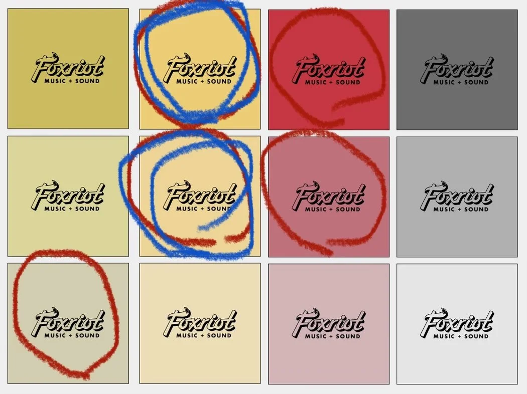
I worked with them to design said logo and pick a brand color. Then, we all fought Wix together to rebrand their website. After that, we drank beer and talked about how annoying Spotify royalties are. All in all, a great gig.
Scope
-Logo Design
-Branding
-Copywriting
Process
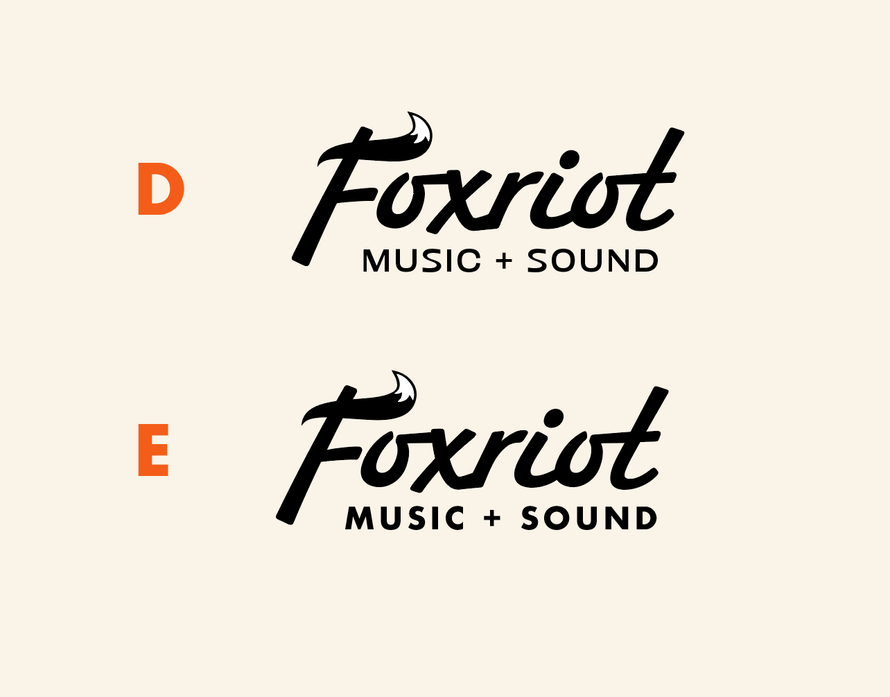
It all starts with sketches. And more sketches. Then digitized versions of sketches. Then colors. Then different colors. It’s a mess. But a beautiful mess.


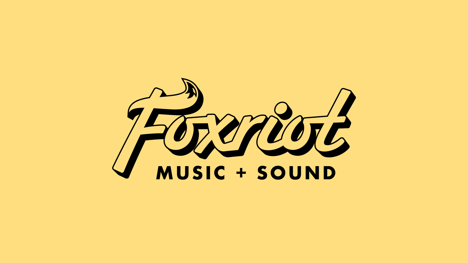
“That’s it! That’s the one!”


Results
Foxriot wanted something that felt like a modern logo with classic roots. So, the final logo takes the tail of a fox, and flips it to make it look like a 50’s rocker pompadour in the top cross of the ‘F.’
The Futura Bold typeface anchors the 3D brush lettering (shoutout to Hoodzpah for the amazing font), and reminds me of a vintage record shop.